Project: TacoAmazing Fire Safety
- Jan 11
- 4 min read
Updated: Jan 26
This month’s challenge in The eLearning Designer’s Academy was to design a job aid for a taco truck. I use these challenges to strengthen my skills across different subject matter and authoring tools, but also because they are an excellent way to learn from others. Everyone receives the same content, guidelines, and branding, and it is always impressive to see how many different design solutions emerge from the same constraints.
For this challenge, I was especially excited to have an excuse to spend more time in Adobe Illustrator and Adobe InDesign, two tools I want to continue building confidence in.
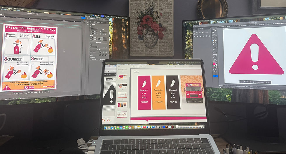
It was a busy month with several other projects in progress, so I knew I wanted to start with strong vector imagery rather than create everything from scratch. After exploring several options and not quite finding what I wanted, I turned to Adobe Express and found a set of clear visuals illustrating the P.A.S.S. method for fire extinguisher use. These became my starting point.
(Scroll to bottom for finished poster!)
Requirements & Constraints
The challenge scenario outlined a very clear need for the job aid:
Tacomazing staff do not receive hands-on practice with fire extinguishers, so they need direct, concise guidance on how to operate them during an emergency. As the instructional designer, the task was to create a printed, easy-to-reference job aid to be posted next to fire extinguishers on the truck. The job aid needed to guide employees through the P.A.S.S. method in a way that supported safe and effective action under pressure.
There were also specific design constraints. The job aid needed to be sized at 18” x 24”, follow the Tacomazing brand standards, and demonstrate strong visual design with consistent use of fonts, colors, imagery, and layout. Most importantly, the poster needed to prioritize clarity and safety.
Design Decisions
From the beginning, I wanted the numbered images to be the primary focus of the poster. In an emergency situation, time is limited and stress is high. Clear, sequential visuals are one of the most effective ways to communicate procedural steps quickly in print.
I also wanted the P.A.S.S. acronym to be highly visible. Since this poster would live in the truck full-time, repeated exposure matters. Seeing the acronym regularly increases the likelihood that it will come to mind during an emergency. I designed the acronym so each letter and corresponding action word could be read at a glance, while placing more detailed instructions in smaller supporting text. These details are not meant to be read in the moment, but over time they reinforce understanding and build confidence for employees who may hesitate without full context.
Because the poster would be viewed frequently, I also included key safety reminders. I chose concise language such as “Stand with the exit behind you” and added a clear directive to stop and evacuate if the fire spreads or produces heavy smoke. A prominent “Call 911” message with a phone icon was included to reinforce next steps.
Although the brand kit included decorative food icons and playful elements, I intentionally left those out. This is a safety resource intended for emergency use, so I prioritized low visual and cognitive load over decoration. Clean, direct, and easy to follow felt like the right choice.
Tools & Workflow
We were free to choose our design tools for this challenge, and I decided early on to work in Adobe Illustrator and Adobe InDesign. Spending more time in these tools was already a personal goal for the month, and this project aligned perfectly.

I really liked the clear imagery of the fire extinguisher use I found in Adobe Express, but wasn't crazy about the overall design of the grid. I wanted the key words of the P.A.S.S acronym to be larger and clearer, and the images to fit the branding of TacoMazing for a clear safety poster that wouldn't be distracting.

I started by isolating each image from the Adobe Express asset, removing backgrounds, and exporting the files for editing in Illustrator. Once there, I expanded and ungrouped the elements so I could fully customize them.

After narrowing down my color palette, I updated the imagery to match the Tacomazing brand. I used the brand’s magenta intentionally as the visual stand-in for the red fire extinguisher to ensure strong contrast and immediate recognition. I also added outlines to the hands, numbers, and arrows to improve visibility and clarity at a distance.
At this point in the process, I had one of those moments that reminds me why I love this field. I stepped away briefly, then came back to see Adobe InDesign open on one monitor, Illustrator on the other, and Adobe Express with the branding guide pulled up on my laptop. All of that, at home, on a random Friday night, while designing a very real fire safety guide for a very fictional taco truck.
Learning design really is a cool field. Being able to move between analysis, design, and development while working across so many different subject areas never gets old.
Layout and Refinement
With the imagery finalized, I moved fully into InDesign. I had already created a basic grid to establish the header, footer, and image sections, which made it easier to place the visuals and text intentionally. From there, it was a matter of balancing hierarchy and spacing so the numbered steps remained the clear focal point.
The final result feels effective and purposeful. With more time, I would likely refine a few elements. The footer is slightly busier than I would prefer, and the “Call 911” message could be even more prominent. I might also revisit the heading or font choice, as something still feels just a bit off. That said, the core goal was met. The steps are clear, the visuals are easy to interpret, and the job aid would provide quick, actionable guidance in an emergency.

Final Thoughts
Challenges like this are one of my favorite ways to stretch creatively, practice new tools, and learn from other designers. I am looking forward to seeing how others approached this same problem and continuing to learn from the community throughout the month.


Comments